
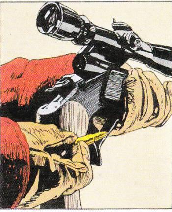
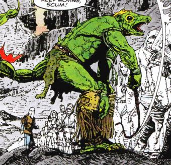
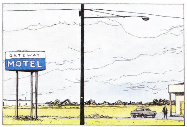
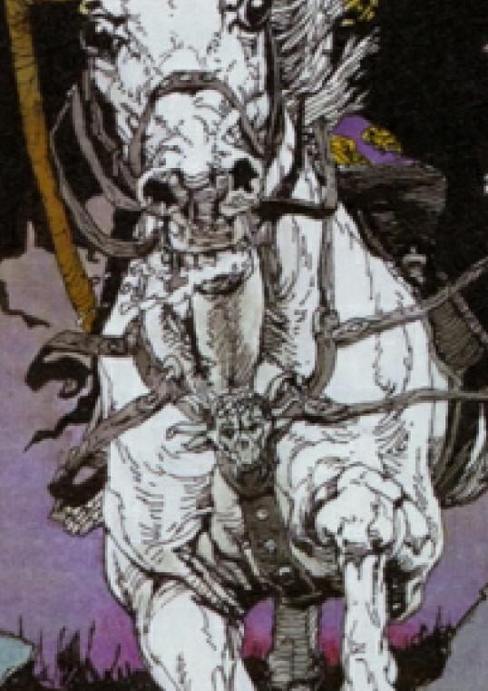
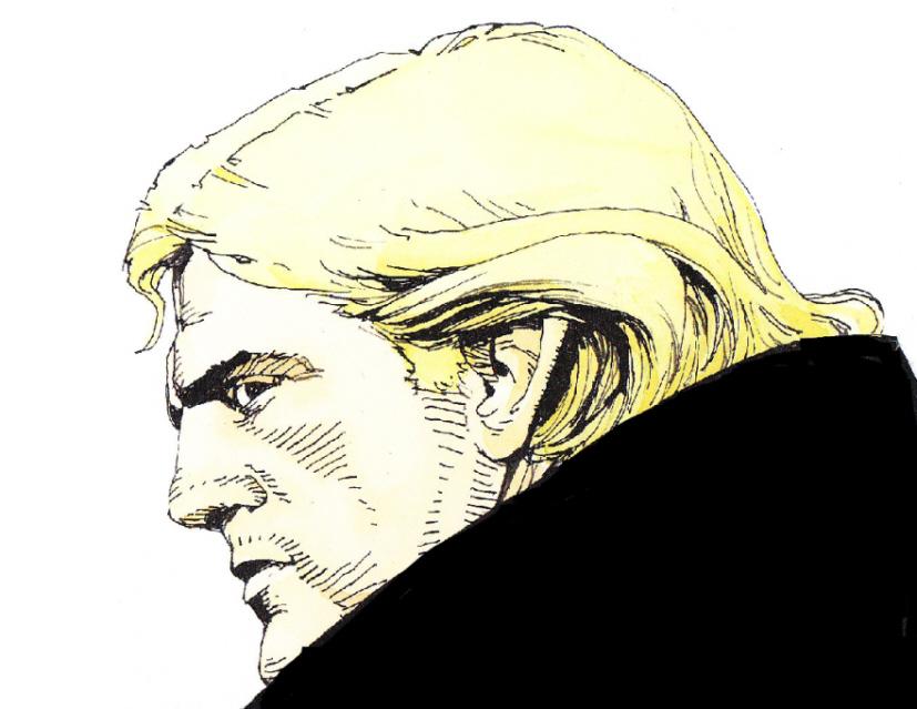
Patient man, good with children, kind to animals, relaxed while waiting for the lights to change. With my daughter as witness I cannot claim I never throw a wobbly, but it is usually short lived. When at Heathrow airport with my son and daughter awaiting a flight to the USA and at emigration it was discovered my daughters passport was date expired did I go to pieces? Yes. But briefly, briefly. Then clear eyed and single minded, daughter and I took a taxi to the Passport office where, thanks to a helpful and efficient staff , a replacement passport was supplied and we took the waiting taxi back to Heathrow to join my son in time for the flight. When the principle of my art school told me my application for the Royal College of Art had been accepted then a few days later said 'oh no it isn't, I made a mistake' I did not punch him in the face. When the architect I was paying to oversee the improvements to the house I was to move into took on a bunch of cowboy builders who did little that wasn't actual material damage I never seriously considered stabbing him to death. I offer these snippets of autobiography to indicate that I am not a man in whom life's setbacks and travails induce Hulk like behaviour. I can take it. I do not lash out. So, though having no plans to inflict bodily harm on those who describe my work as 'photo realistic' if I say I am really really fed up with it you will appreciate that the offence has been sufficiently great and sustained to rile me into undertaking the longest piece of typing I have done since ceasing work on my novel. The latest culprit come across is Paul Gravett in his book '1001 Comics You Must Read Before You Die'* ( it's not true, you don't have to) . He has done it again. "photo-realistic art" he writes. Perhaps he copied and pasted the term from Wikipedia - with thousand-and-one to get through short cuts to research and thinking are to be expected. I blame Bryan Talbot. I believe he was the first to apply the description in a blurb he did for a back cover of a book reprinting some story I had drawn. In fairness I guess he was trying to compliment me, which is after all what book blurbs are required to do, and point out my apparent interest in carefully drawing the appearance of things in the world. An interest that was not always common in comic strips. There was an ambition for accuracy and verisimilitude. ( now there's a word you don't often see in comic-book blog. Sounds like the name of an character from an SF story. Veris Similitude, pilgrim and galactic agent) Anyway. When I discovered the internet I found the term 'photorealist' had turned up on a Wikipedia page under my name. Aided by someone whose professional designation is 'information architect' no less, we edited the page, removing some non-facts and altering the description 'photo- realistic' to 'sometimes mistakenly described as photo- realistic'. Some wise-acre has since seen fit to re-edit and re-state the mis-description. You can't help some people. Subsequently that label seemed to follow my name around like the smell from something in the tread-marks on the sole of a hiking boot of a walker who had just crossed a field full of cows. Yech. Now a small attempt to analysis of the term. 'Photo'. Ooer. Look. The drawings are in pen and ink! Line work. Outline and form indicated with little black marks, dots, squiggles, parallel lines, solid black, cross hatching, wavy lines. Admittedly marks made to try and create in the observers eye the illusion of three dimensions or bring to mind in two dimensions the suggestion what its three-dimensional counterpart might look like, but just black marks nevertheless. No infinite shades from white to black, merely black marks on a white ground. Not like a photograph at all. (What's the matter with these people's eye/ brain operation? One or the other of these components of seeing apparently less than ideal.) Even when coloured there is no infinite spectrum of colour. There are merely black lines containing flat or a limited grading of colour. The same technique as used for Danger Mouse. 'Realism'. I can only imagine that the justification for this term is that objects in the drawings are recognisable as relating to real life objects. Objects, matter, with their countless variety of form, texture and colour is fascinating stuff that occupied fine-art painters for centuries as they graphically presented them in a way that would convince the eye/brain of the observer. Using oil paint to visually create the differences of matter, the fur of a rabbit, the sheen of a grape, to draw attention to the excitement that can be felt in observing nature. Nothing close to the sophistication of that in my work, just my interest in creating a convincing image with the limited tools I chose to use. Rather than a sketch, sign, symbol, indication, suggestion, of a object as is sometimes the case in comic-strips there was an interest in presenting an image that was as authentic as possible. In SF or fantasy strips the wish was that invented objects be seen as convincing and structurally possible in the real world. A further interest of mine that may have attributed to the 'realism' misnomer may have been the background to scenes. It seemed important that the actions depicted took place in a consistent space and that that space was made comprehensible to the reader. There was something like a choreography going on in my mind. Done because it seemed necessary it may have added to the sense of something that could take place in real life. This was done without much thought but an acute and possibly good-looking reviewer** of Button Man drew attention to it and bought it to my consciousness. I don't imagine this topic is a burning issue with many but time spent on it was justified in that it left me feeling better. The irritation I felt is not that there is something inherently insulting about having ones work described as 'photo-realist', or even that it overlooks qualities I feel more important, but that it is wrong. A mistake. A category error. It is not true. Well that's better out than in don't you think? *To date not read '1001 . . .'. Waiting for Father Christmas. Did look at it in a bookshop though so if course know what it said about Button Man. There is a good review at http://www.theguardian.com/books/2011/dec/08/1001-comics-paul-gravett-r… **Not making it up - http://comicsbeat.com/review-john-wagner-and-arthur-ransons-button-man/ Addendum. December 2nd. Had it pointed out (thank you John David Jackson) that in response to 'Ranson Notes' in COMICS INTERNATIONAL #38 December 1993 an Igor Goldkind Comment piece (before arguing his defence of Neil Gaiman about whom I had earlier been less than enthusiastic) contained the words - "Arthur Ranson . . .(whose) fine line photo-realism is a definitive style in comics illustration . . ." It is hard to be cross with Igor as not only was he generally complimentary he did say 'fine line photorealism' which is a little different. I believe this predated Bryan Talbot's bit. Addendum 2. January 5th. I was lucky enough at Christmas to be given a copy of '1001 Comics . .' and see that the 'Button Man' page was in fact not written Paul Gravett but by Ben Dickson. That is the sort of thing that can be problem when rushing into print.
I was looking for one of…
I was looking for one of your pages I saw online sometime ago (a Sapphire & Steel page; in, I think, a Victorian setting) and found this. It is one of the most enjoyable pieces of writing on art I've ever read, cheers ! (gave me a laugh, but also v. perceptive. )
" '1001 Comics You Must Read Before You Die'* ( it's not true, you don't have to)" - give no heed to those who make threatening demands while brandishing the spectre of the Grim Reaper.
I've always taken photorealism to mean art that uses the way cameras 'mistranslate' what's put before the lens - the flattening, the way light bleeds out or erases what's adjacent, and so on. Nothing inherently wrong with that (if these limits are consciously used or adapted), but I read a good comment from Adolph Menzel - [using photos] "is diametrically opposed to my belief in the responsibility of the artist to his art and his self-confudence; & even the continuation of such a method must...lead to the loss if discipline in certain important powers of the eyes, the hand, the memory, and the imagination concerning animated nature." The worst results of this leads to work that doesn't understand what its supposed to convey - the photo references are copied like a carpet-pattern.
The most determined efforts towards realistic depiction in oils did resulted in things with a kind of trompe l'oeil effect like you describe, but even here there is always a kind of 'wavering' spell cast on the viewer, where she or he slips or feels flickeringly experiences like those felt when confronted with the real thing represented, and then back out into objectively regarding it as a skillful simulacrum. There is a frisson here where the viewer experiences both the drawing/painting and the thing represented, blurring together like frames in a magic lantern.
For my own part, I really like your work because it stretches this space wider, all the while finding really effective conduits in line and colour for the subject to be translated through in a way truthful to it (& not relying on a shorthand of effects or visual substitutes). And precisely because it is working simultaneously at these two poles (fidelity to the objects and spaces represented, and the language of how these are represented or translated), it leaves space for the viewer's mind to move between them through or alongside their own experiences, the effect seems to work in the same way as visual symbols work on us, is very involving, & leaves the same resonances.